
Beta Program
Creating a space to try new ideas to improve the experience for certain types of customers, without creating friction for others.
Role
Lead Designer
Platforms
iOS
Android
Year
Early 2020
Concepts
Through a few fast-paced working sessions, the team aligned around four concepts.
A.
Place the experience behind a toggle/tab set on the front page of the app.
B.
Add a new tab to the already long list of tabs in the app.
C.
Insert a button in an available space on the front page of the app that links to the new experience.
D.
Frame the new experience as a "beta" that reshapes the app experience when toggled on.

Concept evaluation
Research and analysis revealed that Concept D, the Beta Toggle, would be the least disruptive to the existing experience and made the most intuitive sense to customers.
The beta toggle would hide discreetly in the "More" tab. User research indicated that most customers understood the idea of a "Beta."

Concepts were rated by how seamlessly they fit into the existing app according to expert review, and how familiar they were to customers as UI patterns according to user research.
Solution
"Try the Beta" invitation on app-launch
Though only a portion of customers received an invitation, all customers could access the beta through the More tab.


Validation
Regular interviews with Beta users
Every two weeks, our researchers conducted interviews wherein customers would share their screen while using the latest version of the app, and provide feedback and thoughts. Previous to this, we were limited to testing only prototypes with fake data, limiting the quality of feedback we could receive. We also used these interviews to get their feedback on working concepts and prototypes.

Note: For the protection of Fidelity Investments and all test participants, I have significantly altered all information in these images to remove any and all personal and confidential information.
Next steps
We continued to add new features, expanding the Beta to serve a wider audience.
With a working beta program providing a low-risk way to experiment and solicit ongoing feedback, we continued to refine our solution for active investors, while introducing more features and changes to serve our other customers.
This expansion has required a significant overhaul to the entire mobile app, an effort for which I acted as Creative Director and Lead Designer.

Validation
Gathered feedback in-app, with particular focus on customers who decided to opt-out
In addition to traffic and usage data, we relied on customers' verbatim feelings to improve the experience over time.
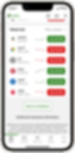


Original UI

New UI
Challenge
How do we test major UI and feature updates to the app targeted at a certain type of customer without disrupting the experience for all customers?
We broke this down into three requirements:
1.
Don't disrupt customers who would not find value in the new experience.
2.
Ensure all existing features remain easily available to customers using the new experience.
3.
Customers must be able to easily return to the original experience.